Let Us Show You Around St. Marc from Counter-Strike: Global Offensive

Collapse
X
 
  • Time
  • Show
Clear All
new posts
  • Shawn Zipay
    Managing Communities 24/7
    • Apr 2003
    • 69279

    #1

    Let Us Show You Around St. Marc from Counter-Strike: Global Offensive

    In last week's update, Valve introduced a new Arsenal Demolition map, St. Marc. I recorded some footage of the map and take you on a virtual tour of the first public release of the map. A few issues here and there but an otherwise decent addition to the Arsenal map lineup, joining up with de_lake from two weeks ago.
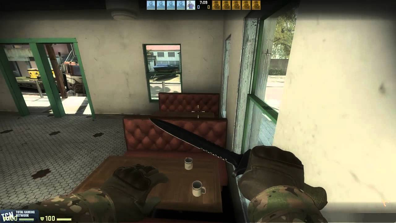

    Feel free to leave your thoughts on the map below and/or give us a quick thumbs up on the above video. Or don't. I mean, that's a-ok too.
  • jimykx
    No, I AM your father!
    • Jan 2010
    • 6641

    #2
    God, it's looking way too similar to left 4 dead to me xD, they could have worked a little bit more with the engine.. (it even has the jukebox model... come on..)

    Comment

    • Shawn Zipay
      Managing Communities 24/7
      • Apr 2003
      • 69279

      #3
      Re: Let Us Show You Around St. Marc from Counter-Strike: Global Offensive

      I think that's just "the" current state of the Source engine. You never really saw it in Portal 2 because it was all indoor environments with very specific color palettes, darker, and simple, repetitive textures.

      It's like living in some weird, muted pastel painting. It looks good. The shadows are absolutely wonderful that they have worked on. Animations all look quite good. But there's just something about it that feels off.

      Comment

      • jimykx
        No, I AM your father!
        • Jan 2010
        • 6641

        #4
        Re: Let Us Show You Around St. Marc from Counter-Strike: Global Offensive

        Originally posted by [MyIS]Zips
        I think that's just "the" current state of the Source engine. You never really saw it in Portal 2 because it was all indoor environments with very specific color palettes, darker, and simple, repetitive textures.

        It's like living in some weird, muted pastel painting. It looks good. The shadows are absolutely wonderful that they have worked on. Animations all look quite good. But there's just something about it that feels off.

        Well, you are right about that aspect about the portal game. To me, it's the washed colors, most likely it's not just that , but in the majority it is what is affecting me the most now. In left 4 dead, that way of presenting things went well with "dark" more Horrific feel/theme of it. It kind of worked as a subliminal way of transmitting feelings of pain and loss, and the feeling that everything is empty and everyone left and you are all by yourself to fight zombies, so the bleached colors didn't really matter and seemed like a "feature". Now it just looks way too much like left 4 dead for me not to notice it, and it feels weird

        Comment

        • norrisey1985
          Member
          • Oct 2011
          • 2

          #5
          yeah, this map looks too similar to left 4 dead 2, kinda a bit awkward if you ask me. too much like the passing or the parish. i think they should try to work with some different settings maybe. idk like a downtown city map, maybe some maps in the snow or like an oilrig type map. just my opinion

          Comment

          Working...